PwC. 2025
BIG WINS on a small budget: Transforming a noisy compliance dashboard into a usable, accessible exp
The My Compliance Dashboard (MCD) is PwC's central compliance hub used by thousands of employees and contractors across service lines to complete mandatory requirements. As the firm's single source of truth for compliance, it plays a crucial role in keeping both people and the business audit-ready.
This case study focuses on the Tasks landing page — the entry point where users view the status across all assigned tasks and take action. Despite being critical, feedback revealed consistent issues:
The Constraints & approach
With limited budget for user research, UX focused on high-impact evaluative methods — conducting a heuristic evaluation and accessibility audit to uncover usability gaps, followed by hypothesis validation through quick internal feedback loops.
The outcome
THE RESEARCH
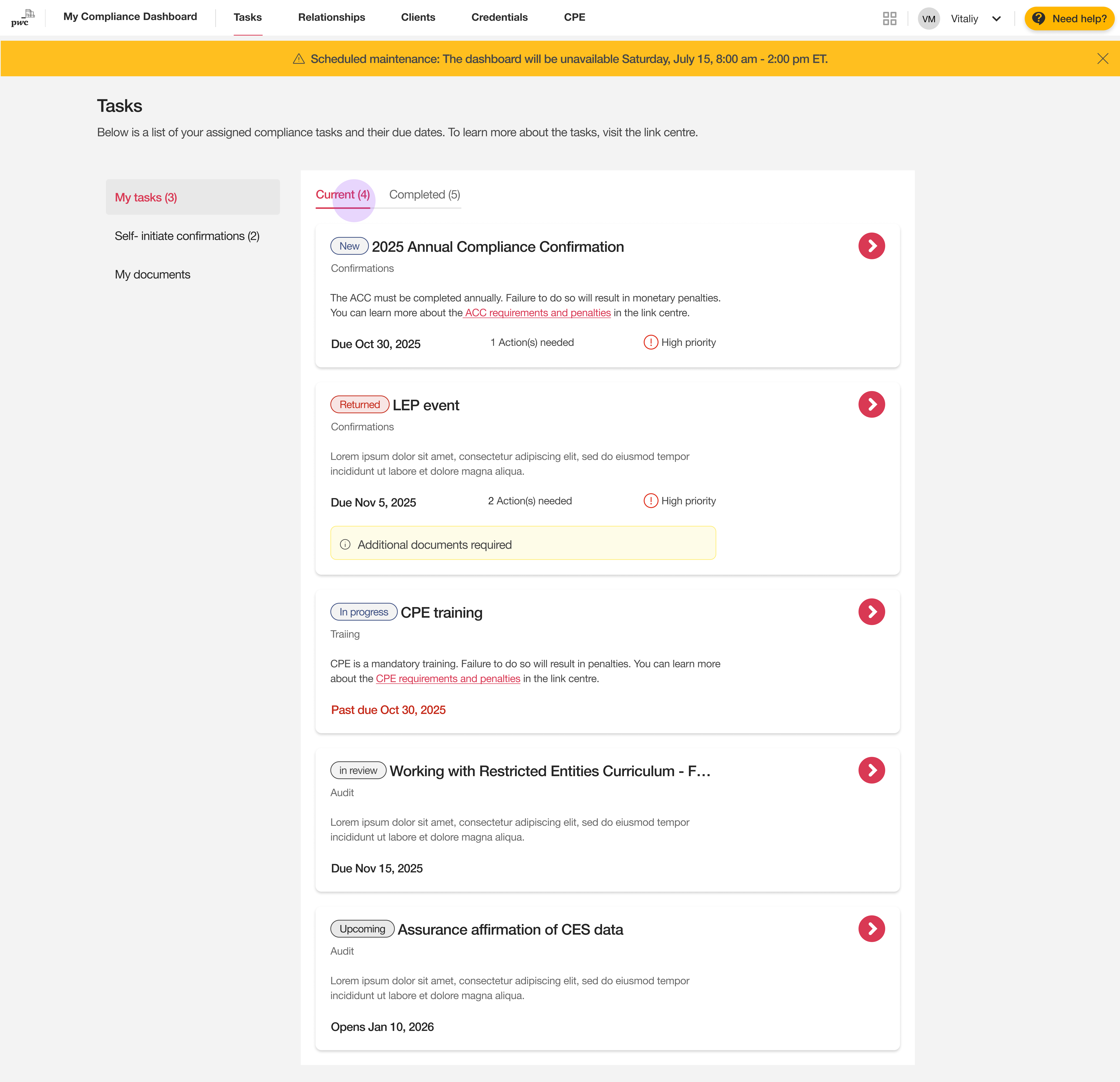
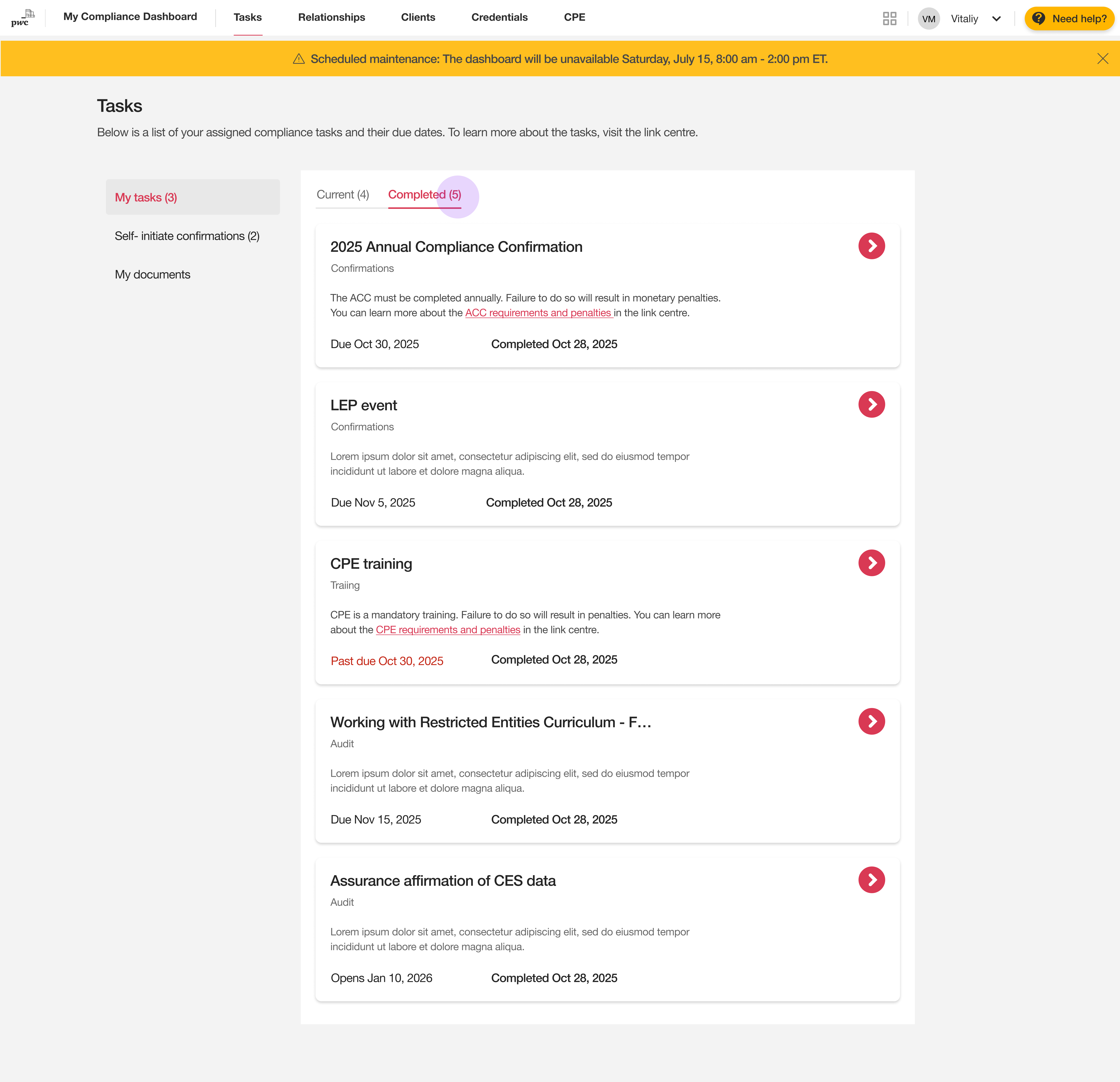
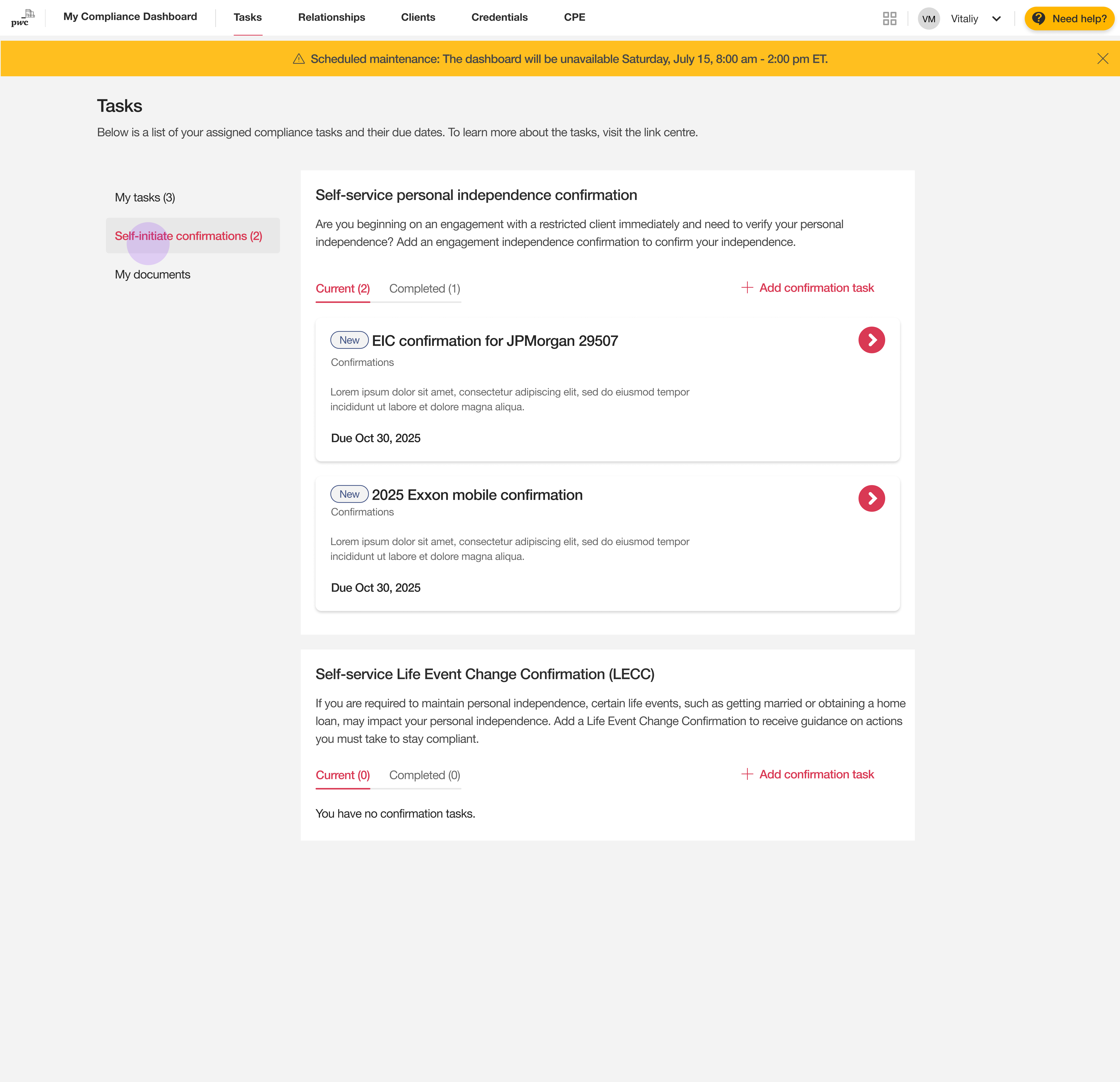
The existing landing page presents tasks within two distinct sections: 'Current' and 'Completed.'
The 'Current' tab displays all active items, including assigned compliance tasks, as well as those that are on-hold or upcoming.
The right panel provides access to self-initiated actions, allowing users to start new workflows independent of their assigned compliance duties.
My heuristic evaluation of the existing layout revealed significant usability and aesthetic issues.
THE DESIGN STRATEGY
1. Establishing clarity with task status indicators
Following business input, only high-priority tasks will be explicitly marked as 'High'.
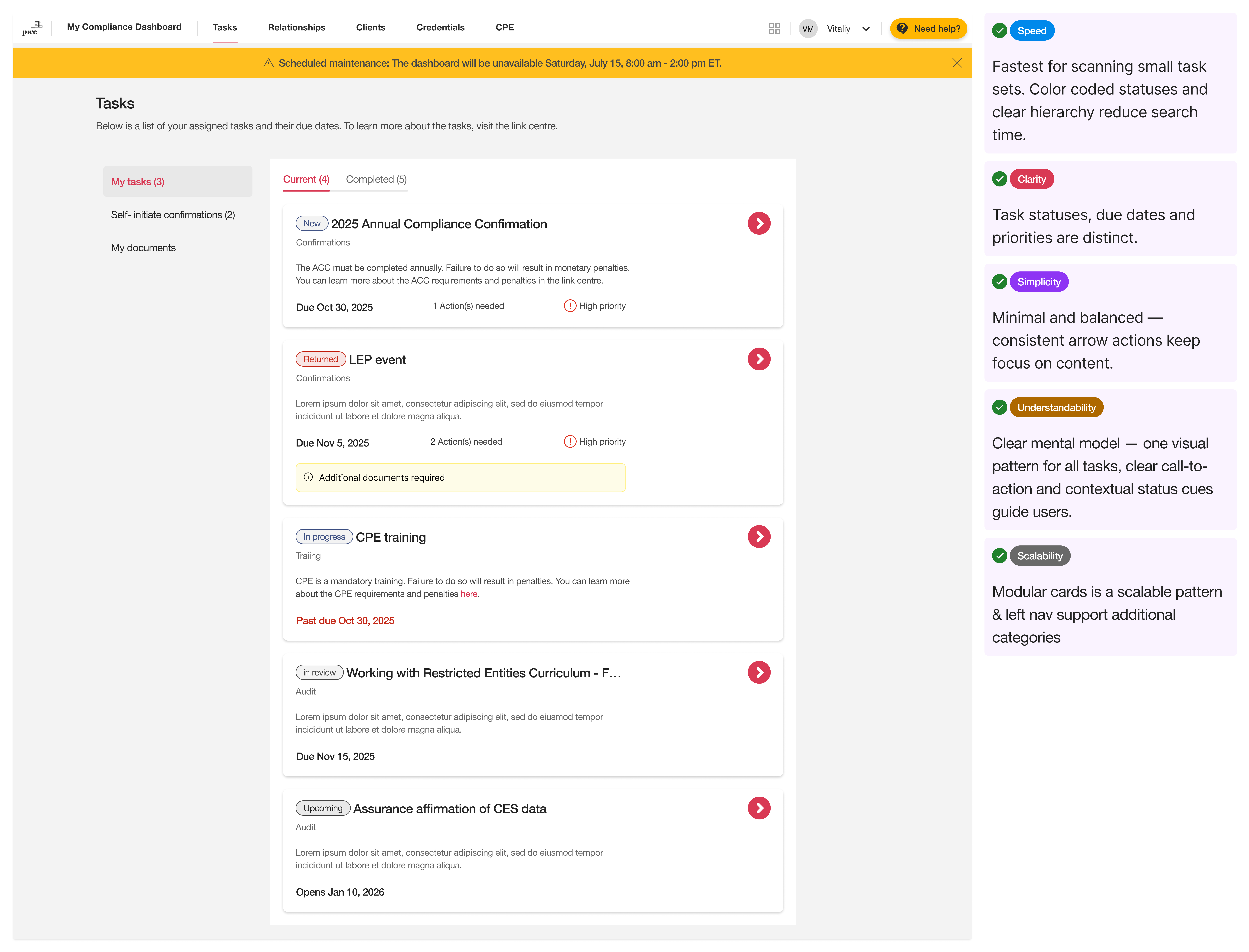
2. Establishing metrics for evaluation
To ensure the redesigned dashboard met clear usability goals, we introduced a new set of evaluation metrics that had not been applied to the previous design. These metrics helped us quantify and validate improvements in both usability and aesthetics.The dashboard was evaluated against five key metrics that matter most to both business and users:
Speed, Clarity, Simplicity, Understandability, and Scalability.
THE ui layout
We explored existing layouts within the PwC ecosystem to design solutions that feel familiar and maintain visual consistency.

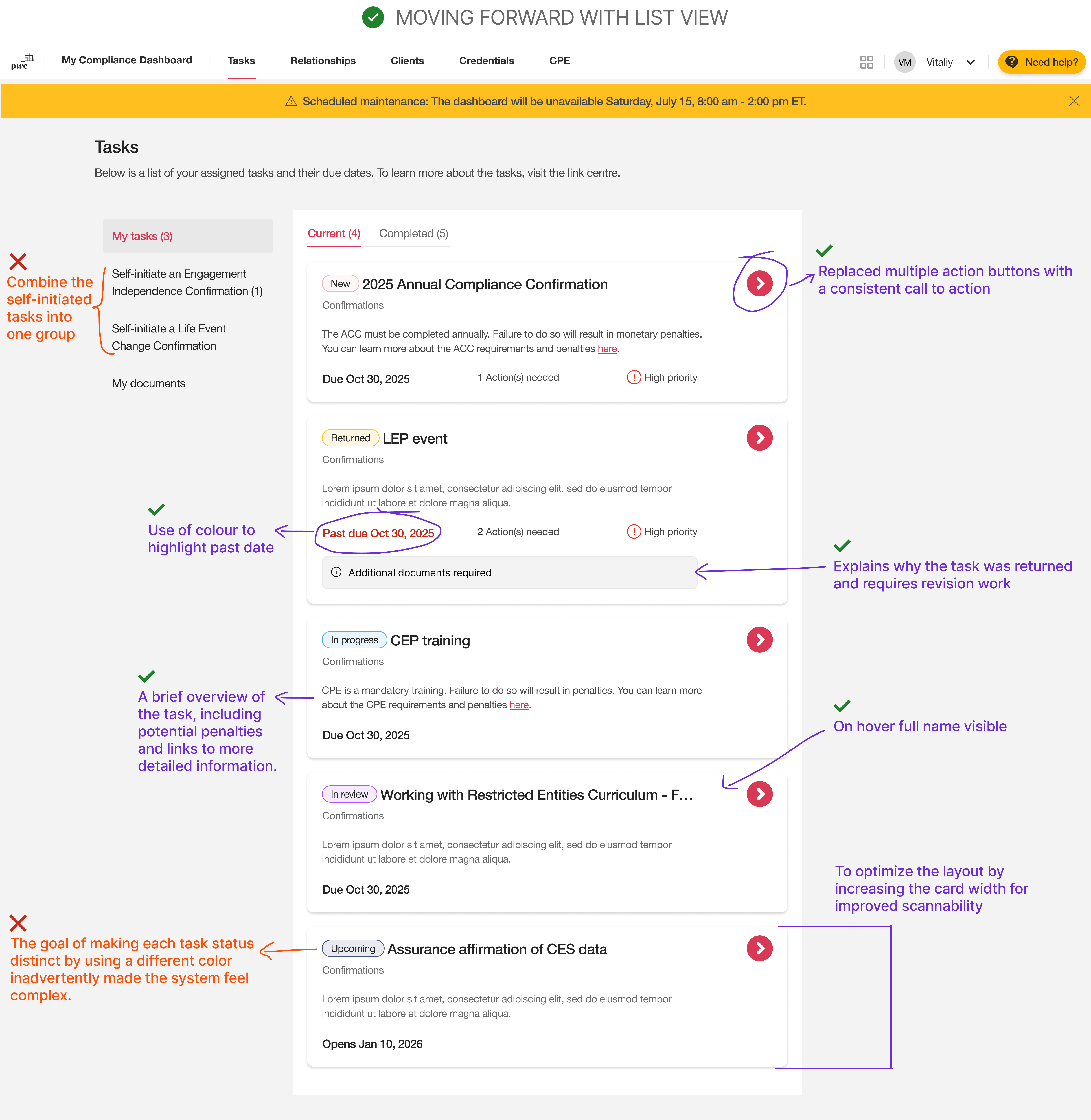
Based on the task states and their associated actions, here is a logical grouping using only three colors:
Color 1: Blue (Actionable like New, In progress)
Color 2: Red (Requires attention like Returned)
Color 3: Grey (Informational/ No action required like In review and Upcoming)
The final design achieved all usability goals:
THE ACCESSIBILITY GOALS
I created a developer handoff with a curated list of accessibility notes that will help ensure that compliance dashboard meets WCAG 2.2 AA standards on desktop and tablet.


.svg)

