
UX Audit & Redesign of Dashboard
Performance Management tool. 2023
Why redesign the dashboard?
The frequency of user visits and the time spent on the dashboard are low because users lack the time to navigate a complex dashboard. Research identified four major problems with the old dashboard:
How might we transform our dashboard to improve usability, enhance clarity, and optimize for tablet devices to boost employee performance?
Understanding the problems
Heuristic evaluation + Usability testing
I began with a Heuristic review to identify usability issues in the dashboard. After the heuristic evaluation, I conducted unmoderated usability testing with 10 participants using UserZoom. This testing helped validate the findings, assess their effectiveness from the users' perspective, and prioritize them.


Goals
Develop
Constraints - Key points to consider for the redesigns:
Exploration
I started organizing content by grouping related information and determining how elements on the dashboard relate to each other and improved the flow.
.png)
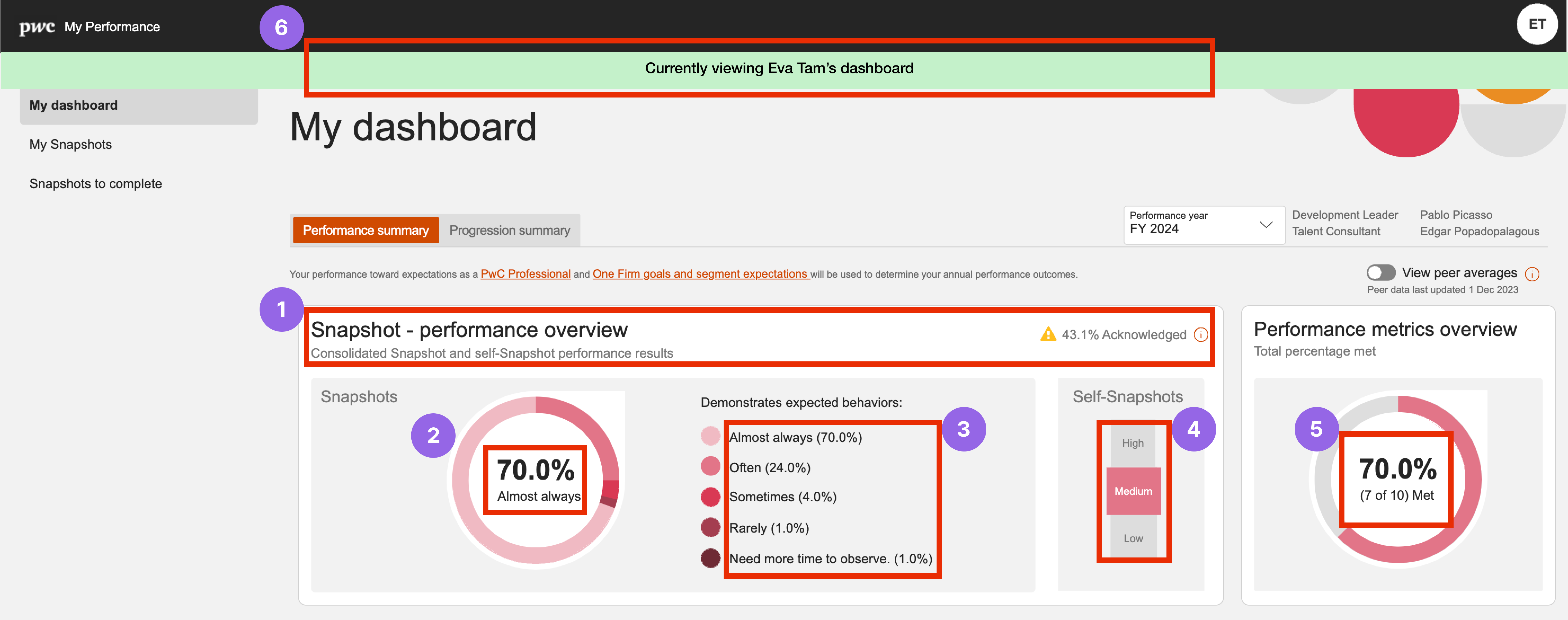
# Must know information is placed above the fold to improve usability for both employees and proxy access.


# I explored various ways to display the feedback rating for each question but opted for a color-coded progress bar because it clearly shows the percentage distribution across different ratings.

# The table uses collapsible rows to display reviewers' comments, which explain the aforementioned ratings and are particularly useful for leaders seeking quick access.
Allowing snapshots to open as modal windows instead of tabs keeps the interaction within the current page, reducing system overload, improving data security, providing clear navigation and enhancing user focus.
In the tablet format, the number of columns have been reduced to minimize clutter.

# The metrics have been reorganized to display quarter by quarter, with color-coded results that help users quickly grasp successes and identify areas of improvements.
To guide users effortlessly to the help documentation, I've created clear prompts with noticeable visual cues, and strategically positioned them on the page.

# The final progression status stands out in pink and is easily identifiable.
To better justify progression results, the business plans to add a "Goal Tracking" section to help employees set goals with their managers/coaches and compare results, ensuring fair and transparent outcomes.

Results
We conducted a study of the final designs before handing them off to the developers. We wanted to get an understanding whether users' and business requirements aligned with the intentions behind the redesigns.
Good news, the new dashboard has been well-received. "Clear," "Useful," "Quick," "Intuitive," and "Appealing" were terms that were used to describe the impact of the new design. Every small improvement has helped users feel more confident about their performance results, enabled them to make informed decisions and motivated them to initiate snapshots in a timely manner.